Ask someone their favorite font and you'll most likely weed out the left brains from the right. A left brainer will see the font as a vessel for communication and not think much about which one is chosen. On the other hand a right brainer will see font as a way to express feeling and style. No matter which side of your brain is dominant or you identify with here are three basic rules that everyone should know.
Style Matters
Fonts come in many shapes and forms however they can be classified into distinct
styles; Serif, Sans Serif, Slab Serif, Handwritten, Script, Decorative and Modern. See the definitions below for more information.
Serif: A font containing a small line attached to the end of a stroke in a letter or symbol.
Sans Serif: A font with the lack of small line attached to the end of a stroke in a letter or symbol.
Slab Serif: A type of serif typeface characterized by thick, block-like serifs.
Handwritten: A front in the style of a person's writing created with a writing utensil such as a pen or pencil either printed or cursive.
Script: A font based upon the varied and often fluid stroke created by handwriting.
Decorative: A font used decorative or ornamental purposes usually created for a specific theme or idea.
Modern: A font marked by high contrast between thick and thin strokes.
 And NO Typeface, is not the same as a font. Typeface is the combination of one font into many styles (bold, italic, narrow, semi bold, etc.).
Each font is built up of specific characteristics that when combined make the look unique. Check out the anatomy of font below:
Arc - An arching stroke is called a shoulder or sometimes just an arch, as in h n m.
Aperture - The aperture is the partially enclosed, somewhat rounded negative space in some type characters such as n, C, S, the lower part of e, or the upper part of a double-storey a.
Apex - A point at the top of a character where two strokes meet.
Ascender - Any part in a lowercase letter that extends above the x-height.
Axis - An imaginary line drawn from top to bottom of a glyph bisecting the upper and lower strokes is the axis.
Bar - The horizontal stroke in the A, H, e, t and similar letters.
Baseline - The imaginary line upon which the letters in a font appear to rest.
Cap Height - The height from the baseline to the top of the uppercase letters.
Counter - The enclosed or partially enclosed circular or curved negative space (white space) of some letters such as d, o, and s is the counter.
Crossbar - The horizontal stroke in letters.
Descender - Any part in a lowercase letter that extends below the base line.
Dot - A small distinguishing mark, such as an diacritic on a lowercase i or j.
Ear - Typically found on the lower case ‘g’, an ear is a decorative flourish usually on the upper right side of the bowl.
Eye - Much like a counter, the eye refers specifically to the enclosed space in a lowercase ‘e’.
Finial - A tapered or curved end.
Hook - A curved, protruding stroke in a terminal.
Leg - Short, descending portion of a letter.
Lobe - A rounded projecting stoke attached to the main structure of a letter.
Loop - The enclosed or partially enclosed counter below the baseline of a double-story g.
Stem - Vertical, full-length stroke in upright characters.
Tail - A descending stroke, often decorative.
Terminal - The end of a stroke that does not include a serif.
X-Height - The height of lowercase letters reach based on height of lowercase x; does not include ascenders or descenders.
Font Expresses Feeling
Each font family is known to creating specific feelings or a generalized perception.
Serif is known for being traditional, respectable and reliable often being used in association to professions such as lawyers and doctors.
Sans Serif is seen clean, universal and modern making it ideal for web viewing.
Slab Serif is seen as bold, strong and solid making it ideal for statue placques and statement aspects of advertising.
Handwritten is seen as childish and personable making it idea for toys or companies based on a person.
Script is seen as elegant, friendly and even feminine making it ideal for beauty products.
Decorative is seen as a novelty and should be used sparingly unless a strong sense of the theme needs to be conveyed.
Modern is seen as exclusive, stylish and sharp so it's best used for textiles and niche companies.
Along with the specific font being used the color, size and typeface can also effect the way a reader perceive the written words. For example purple is considered to be a color of royalty, large size fonts demand attention and the bold typeface forces readers to stop and pay attention.
Application is Key
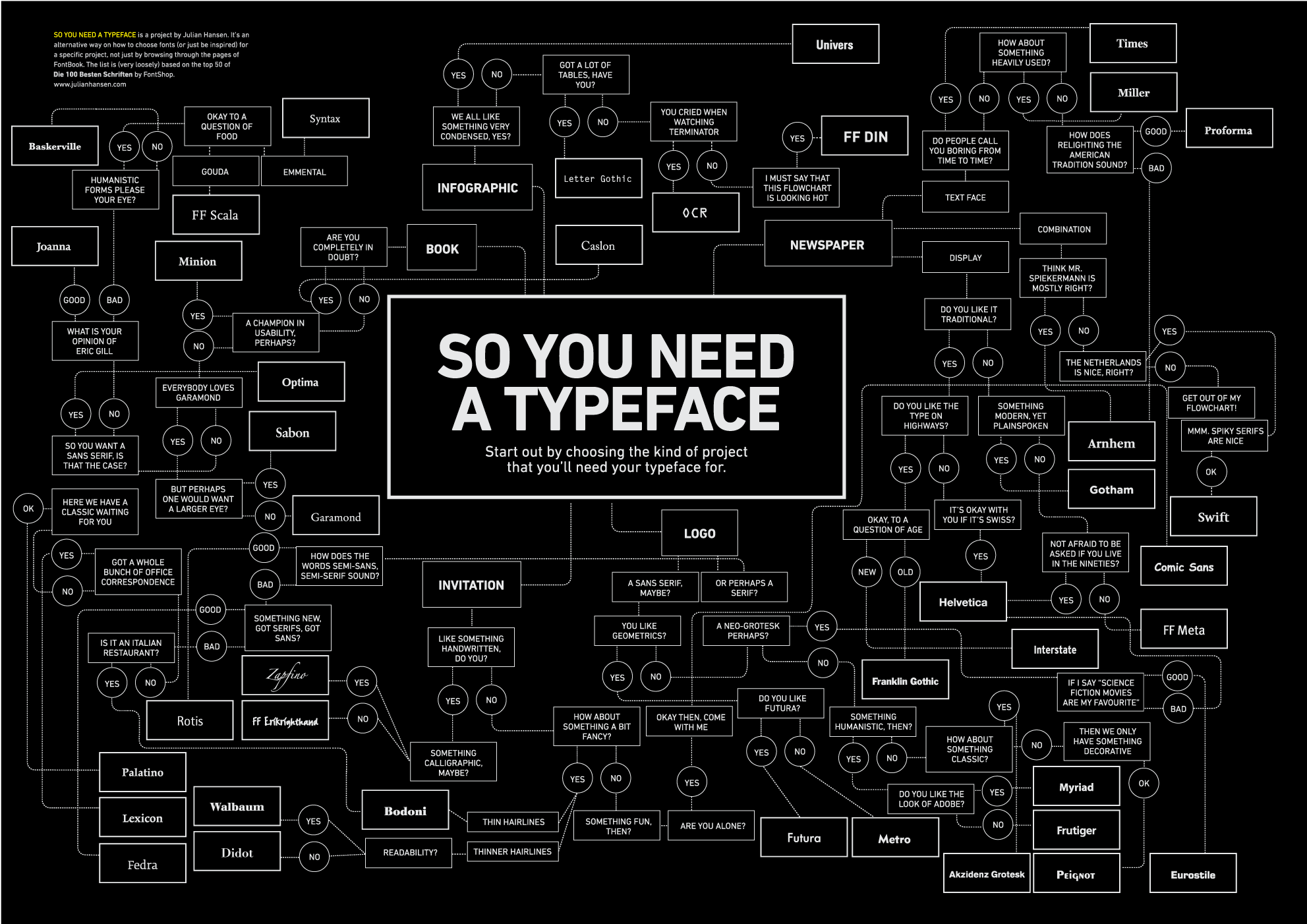
Ask the right questions. What kind of message do I need to convey (subliminal or out right)? How do I want the reader to feel? What is important? What colors would work well with this style? Knowing the message that needs to be conveyed or the feeling which should be elicited can help guide the choices that are made. Applying the previously knowledge is definitely the biggest step in successful use. Font is also one of the easiest things to alter in order to add an extra level of pizzazz so play around until you find something that works and you feel proud of.
For more information on font check out these resources:
http://www.cooldailyinfographics.com/post/the-psychology-of-fonts
https://www.cardprinting.us/blog/2013/03/guide-to-professional-typography/
http://inspirationlab.files.wordpress.com/2010/04/infographiclarge_v2.png
http://www.hongkiat.com/blog/top-10-fonts-designers-love-infographic/
http://247main.com/2012/11/what-if-fonts-had-their-own-infographic/
http://visual.ly/10-commandments-typography
http://www.webdesignerdepot.com/2013/03/serif-vs-sans-the-final-battle/
http://www.fastcodesign.com/3028971/whats-the-difference-between-a-font-and-a-typeface
http://www.typographydeconstructed.com/category/type-glossary/
https://precisionintermedia.com/anatomy-and-glossary-type
http://www.typeconnection.com/step1.php (Great resource for helping to pair fonts)
http://www.tothepoint.co.uk/more/fun/shoot_the_serif/ (Fun game on visually be able to tell the different between serif and sans serif)
http://type.method.ac/# (Fun game teaching techniques on kerning)
http://fontsinuse.com/ (See how other designers use font in their creations)
http://www.whatfontis.com/ (Tool to help identify a font being used that is not specifically named)
My favorite font is....well I have a couple! It depends on what feeling or message I'm trying to convey, remember! My top five are Cabin, Dancing Script, Adobe Garmond Pro, Harry P, and Segoe Print! Don't forget to comment below or catch me on Twitter (@jvalley0714) to tell me what's your favorite font!