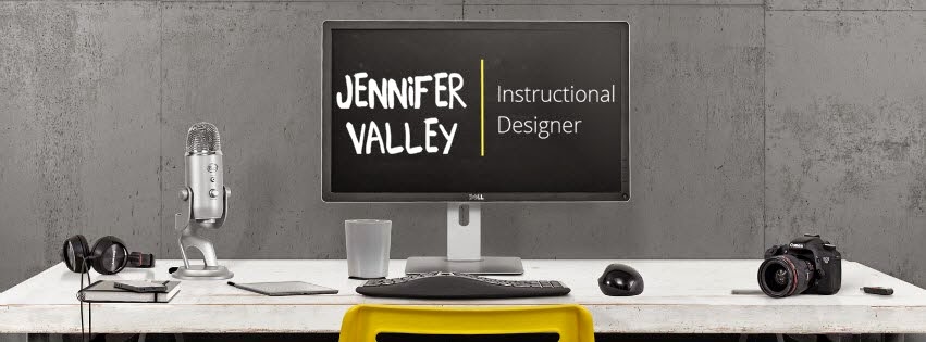
I hate code! I have always been fascinated by the idea of scripting something behind the scenes and like magic it appears. This redesign however has dwindled my faith in becoming an HTML and CSS master.
Throughout this process there have been a lot of surprising things I've learned about myself or had to examine. I always had a feeling that I was a Sans Serif kind of gal but now I KNOW. I decided to document my blog redesign before, during and after.
Before
- Don’t be afraid to change your mind!
- Set up an inspiration board:
- Look for companies/websites that will provide you with insight and examples:
- http://www.scribblesofvalerie.com/2013/08/free-blogger-template-download-eternal.html (I ended up using this one as a base :) )
- Soul search to know what you want
- Theme
- Watercolor
- Gadgets
- Click to Pin
- Click to Tweet
- Font
- Combination of Script and Sans Serif
- Color
- Blue, Green, Gray (combination or variations of each paired together)
- Prep yourself for the time and effort it will take
- Do I have the skill and time to create a new design?
- Yes, I'll make time and learn the skills necessary.
- Do you have the time to do a big bug hunt?
- Yes, I'll make time.
- Ask yourself the hard questions
- Who will be in charge of the redesign?
- Well me of course!
- What's my personality? What best represents me?
- Light, airy, blue/green, watercolors, sans serif font, simple, lots of gadgets
- When do I want to roll this out?
- During 2nd quarter
- Is the current design stale and old fashioned?
- Yes!
- Do you need a redesign in order to tighten and update the web code?
- Yes (I didn't know this until I was already half way into the build lol)
- Will your current web content lend itself well to your new design?
- The articles yes, the pictures no. Update pictures later?
- Can you make the website more efficient and usable?
- Yes. Having a three column design will let me spread out my gadgets on top of the screen better.
During
- Don’t be afraid to change your mind!
- Technology is limited
- I was left with only using Google Fonts since I'm unable to download new fonts onto my tablet.
- Don't be too picky. Being particular is one thing. Trying to reach perfection will end in an incomplete project.
- Coding is hard
- I have no coding skills what so ever. I found myself relying on blog posts, articles and google searches to get the look and feel I wanted.
- Best article on how to add Google web fonts to your blogger blog: http://www.carrieloves.com/2012/02/how-to-add-google-web-fonts-to-your-blogger-blog/
- How to add a Pinterest hoover over your pictures:http://www.digitalkonline.com/blog/how-to-add-a-pinterest-hover-button-to-your-blogger-images/
- Click to Tweet Generator:http://clicktotweet.com/
After
- Ask yourself if what you’re doing turns the hard questions into answers
- Don’t be afraid to change your mind (do you see the reoccuring theme)
- Test test and test again
- Here's a checklist:http://lite.launchlist.net/
- Does the design provide solid answers to my hard questions?
- Yes
- Did I carry out the design to my other social media sites?
- Yes
- What did I miss?
- Rearranged the gadgets
- Deleted unused gadgets
- Added the Pinterest hoover after the original launch
Source:
http://www.webdesignrazzi.com/2014/10-things-to-consider-before-going-in-for-a-new-website-design/
http://www.webdesignrazzi.com/2014/10-things-to-consider-before-going-in-for-a-new-website-design/
Did I miss anything crucial? Do you like the redesign? What is stopping you from updating?
I still have a couple more things i'd like to do and try but like anything else it's a work in progress.
I still have a couple more things i'd like to do and try but like anything else it's a work in progress.


No comments:
Post a Comment